©2026 - Lukas Kawakami
↖
Network Rail
about
credits
Design Bridge & Partners
Creative Direction:
Hayley Barrett
Design:
Natalie Hughes, Nathalie Bland, Ian Robertshaw
Motion Design:
Lewis Son, Adam Hingley
3D Creative Direction:
Rodrigo Ortega
3D Design:
Lukas Kawakami
Copywriting
James Minta
Project Management:
Talitha Watson
Client Management:
Hannah Pocock, Katie Roberts
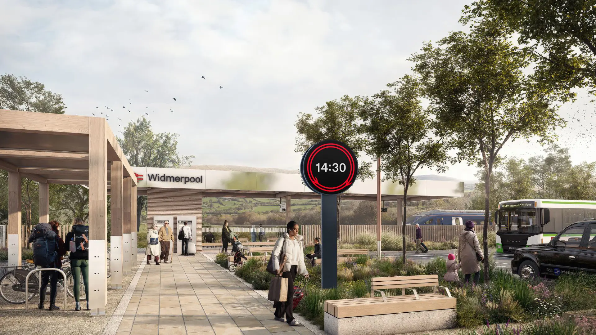
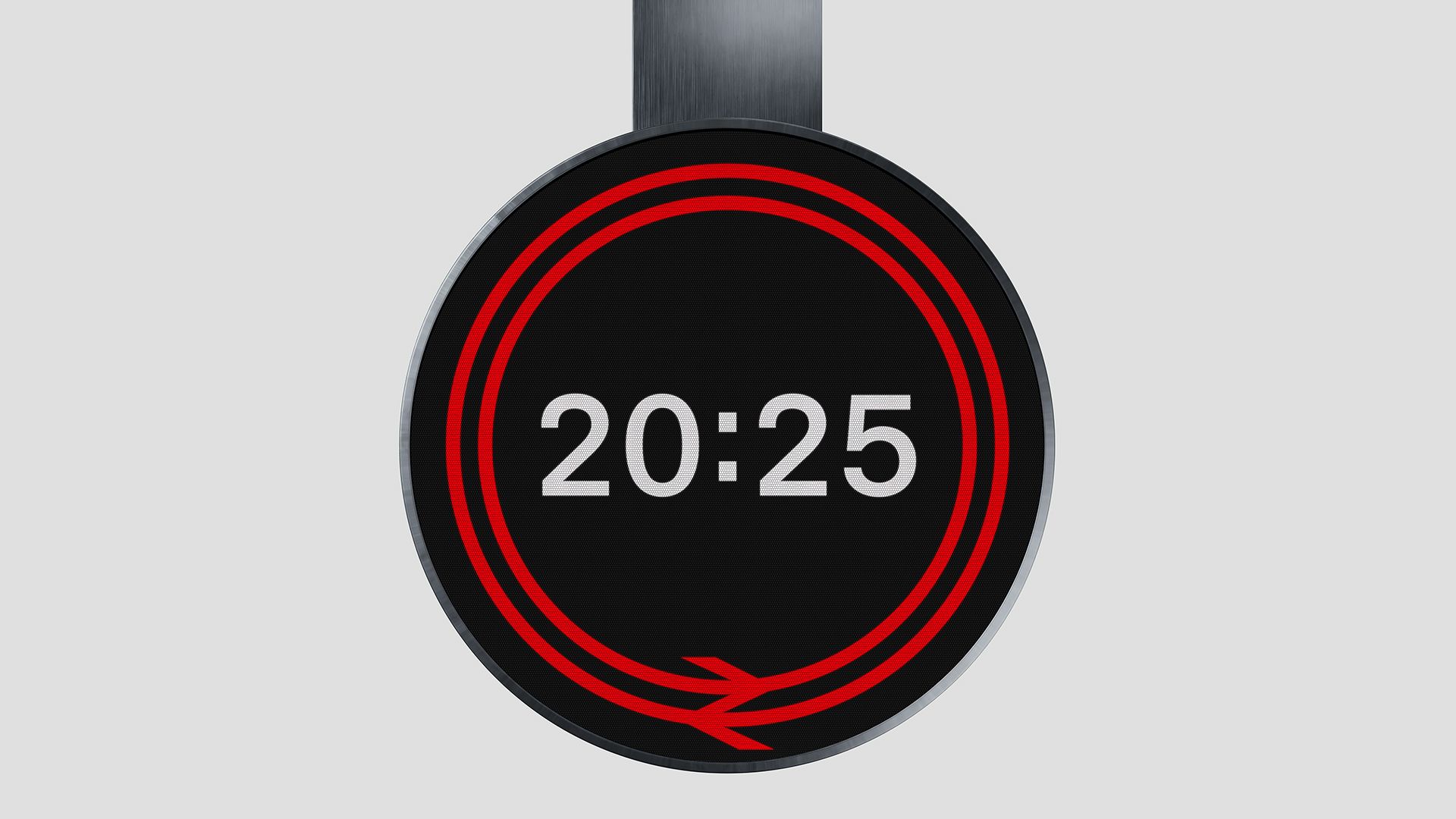
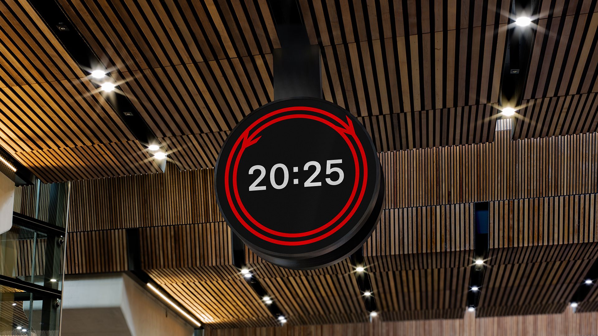
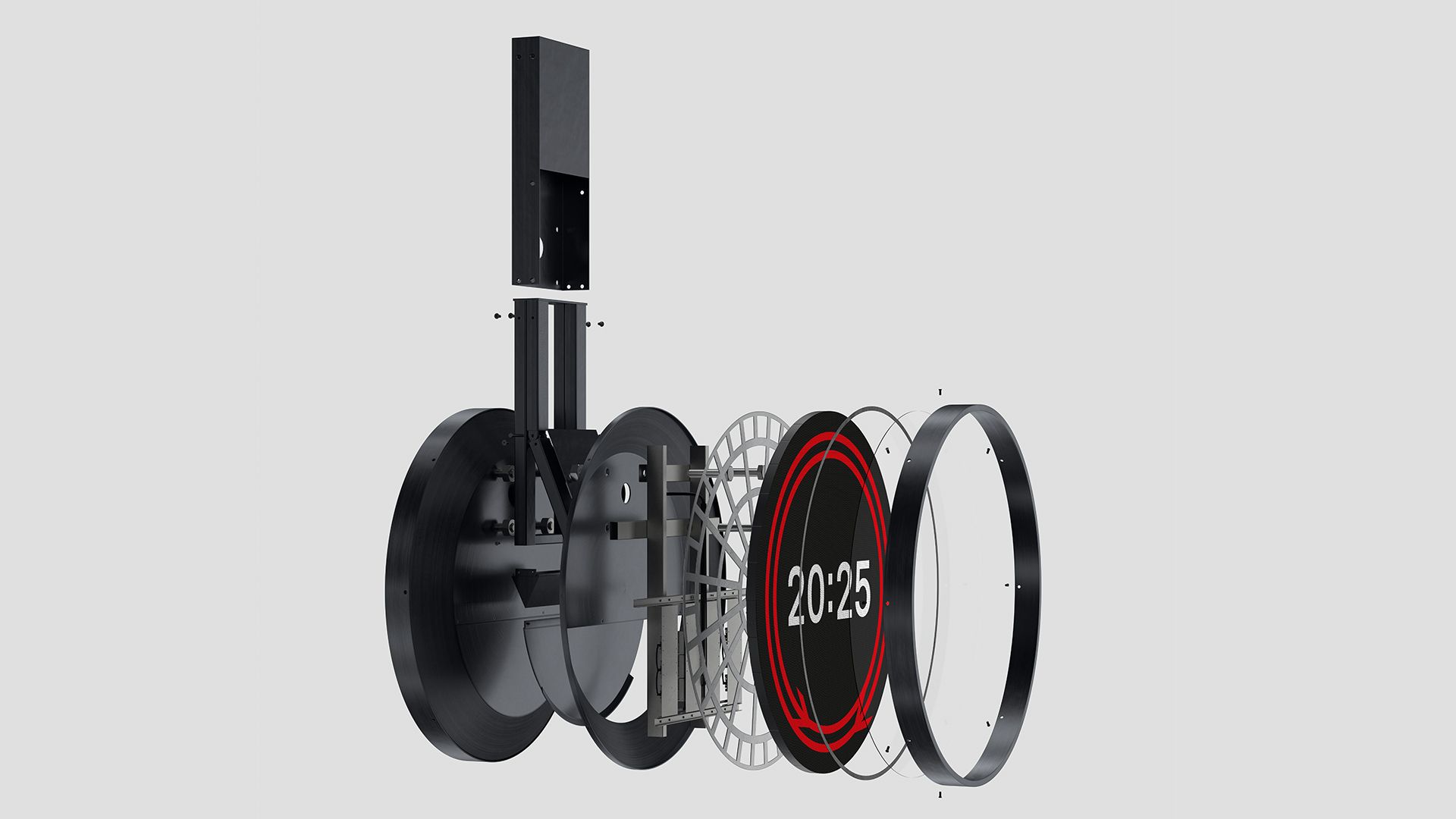
Design Bridge and Partners was tasked with creating a standardised, consistent and accessible clock design to significantly enhance the passenger experience, while reflecting the design and brand history of the railway, which marks its 200th year in 2025.
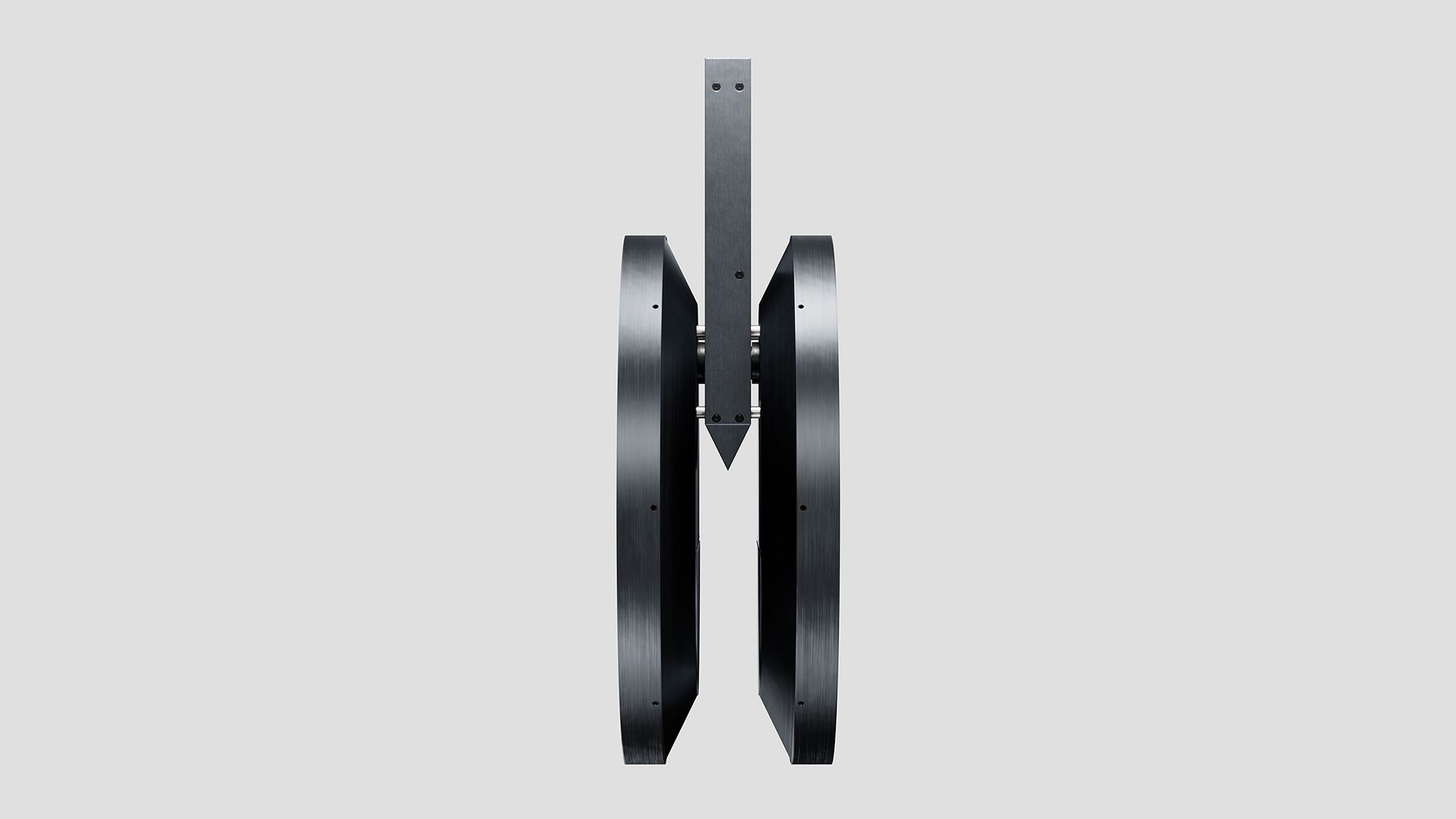
The 1.8 metre timepiece takes inspiration from the timeless graphic symbol of the railway: the iconic double arrow logo, created by Gerry Barney in 1965. The double arrow motif is dynamically integrated into the clock face, with its two halves travelling in opposing directions, converging precisely every 30 seconds. This subtle yet powerful visual metaphor speaks to the constant flow and convergence of journeys.
At its heart, a bold 24-hour display features an updated iteration of the railway’s own typeface, Rail Alphabet 2, originally developed by Margaret Calvert and digitised by Henrik Kubel.
back
©2026 - Lukas Kawakami
↖
about
credits
Design Bridge & Partners
Creative Direction:
Hayley Barrett
Design:
Natalie Hughes, Nathalie Bland, Ian Robertshaw
Motion Design:
Lewis Son, Adam Hingley
3D Creative Direction:
Rodrigo Ortega
3D Design:
Lukas Kawakami
Copywriting
James Minta
Project Management:
Talitha Watson
Client Management:
Hannah Pocock, Katie Roberts
Design Bridge and Partners was tasked with creating a standardised, consistent and accessible clock design to significantly enhance the passenger experience, while reflecting the design and brand history of the railway, which marks its 200th year in 2025.
The 1.8 metre timepiece takes inspiration from the timeless graphic symbol of the railway: the iconic double arrow logo, created by Gerry Barney in 1965. The double arrow motif is dynamically integrated into the clock face, with its two halves travelling in opposing directions, converging precisely every 30 seconds. This subtle yet powerful visual metaphor speaks to the constant flow and convergence of journeys.
At its heart, a bold 24-hour display features an updated iteration of the railway’s own typeface, Rail Alphabet 2, originally developed by Margaret Calvert and digitised by Henrik Kubel.
back
Network Rail
↖
©2026 - Lukas Kawakami
Network Rail
about
credits
Design Bridge & Partners
Creative Direction:
Hayley Barrett
Design:
Natalie Hughes, Nathalie Bland, Ian Robertshaw
Motion Design:
Lewis Son, Adam Hingley
3D Creative Direction:
Rodrigo Ortega
3D Design:
Lukas Kawakami
Copywriting
James Minta
Project Management:
Talitha Watson
Client Management:
Hannah Pocock, Katie Roberts
Design Bridge and Partners was tasked with creating a standardised, consistent and accessible clock design to significantly enhance the passenger experience, while reflecting the design and brand history of the railway, which marks its 200th year in 2025.
The 1.8 metre timepiece takes inspiration from the timeless graphic symbol of the railway: the iconic double arrow logo, created by Gerry Barney in 1965. The double arrow motif is dynamically integrated into the clock face, with its two halves travelling in opposing directions, converging precisely every 30 seconds. This subtle yet powerful visual metaphor speaks to the constant flow and convergence of journeys.
At its heart, a bold 24-hour display features an updated iteration of the railway’s own typeface, Rail Alphabet 2, originally developed by Margaret Calvert and digitised by Henrik Kubel.
back