©2026 - Lukas Kawakami
↖
Kiro Switchel
about
credits
Polar LTDA.
Creative Direction:
Bruno Ribeiro, Lais Ikoma,
Ralph Mayer, Ronaldo Vidal
Identity Illustrations:
Stella Bonici
Illustrations:
Fabrizio Lenci
3D Design:
Lukas Kawakami
3D Motion Design:
Visor.ooo
Kiro
Leeward Wang, Roberto Meirelles
Since 2017, the company’s purpose has been to offer a drink that is not only healthy and clean label, but also to create a sustainable business capable of strengthening small producers.
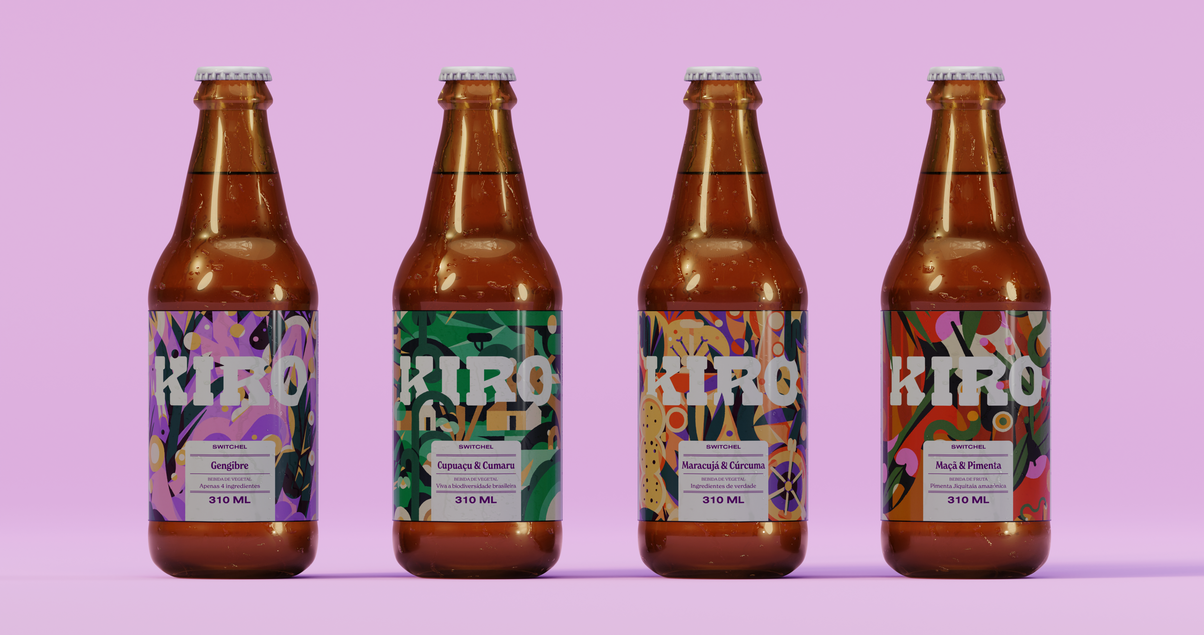
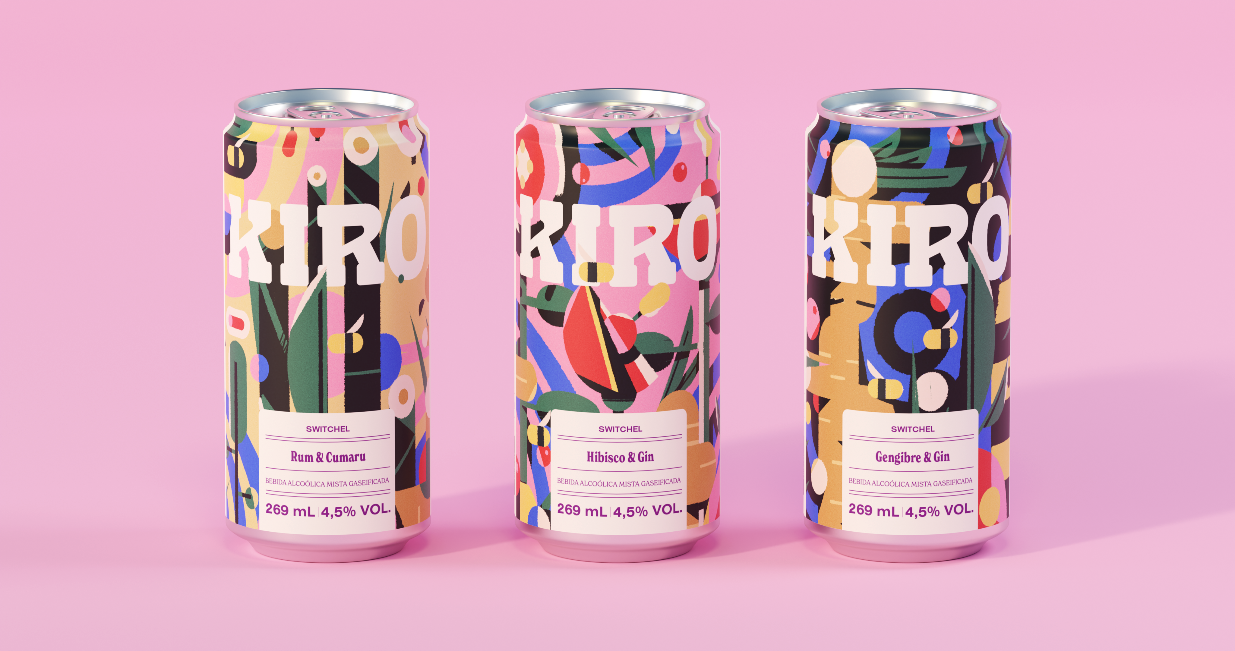
The four flavors and the canned version (carbonated and alcoholic) are made with ingredients of agroecological origin. Nowadays, production, which started in the home of one of the founders, takes place in its own factory in São Paulo, granting full control of the production chain. All this care, combined with the intense and refreshing flavor, makes Kiro a brand with a devoted public.
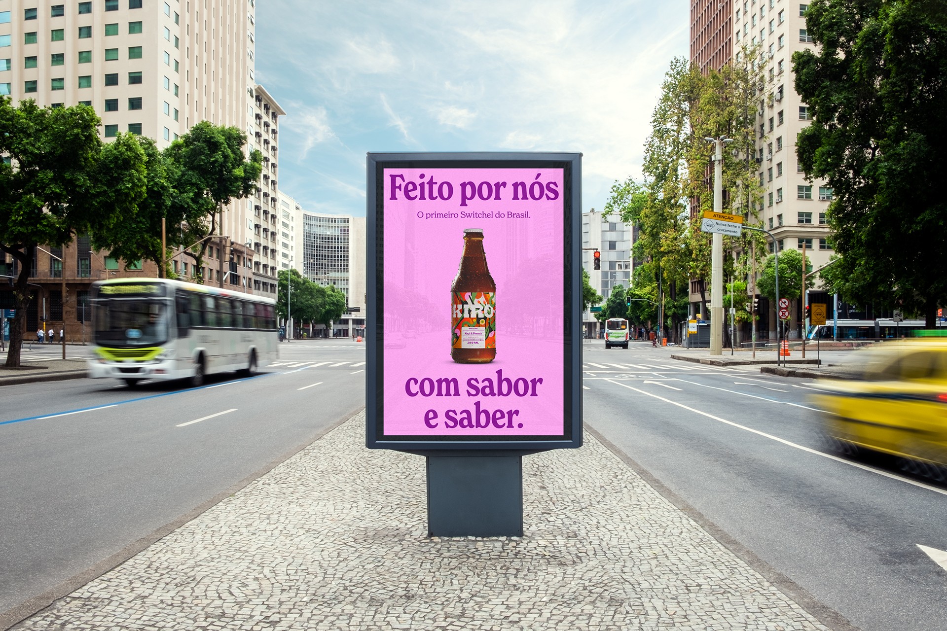
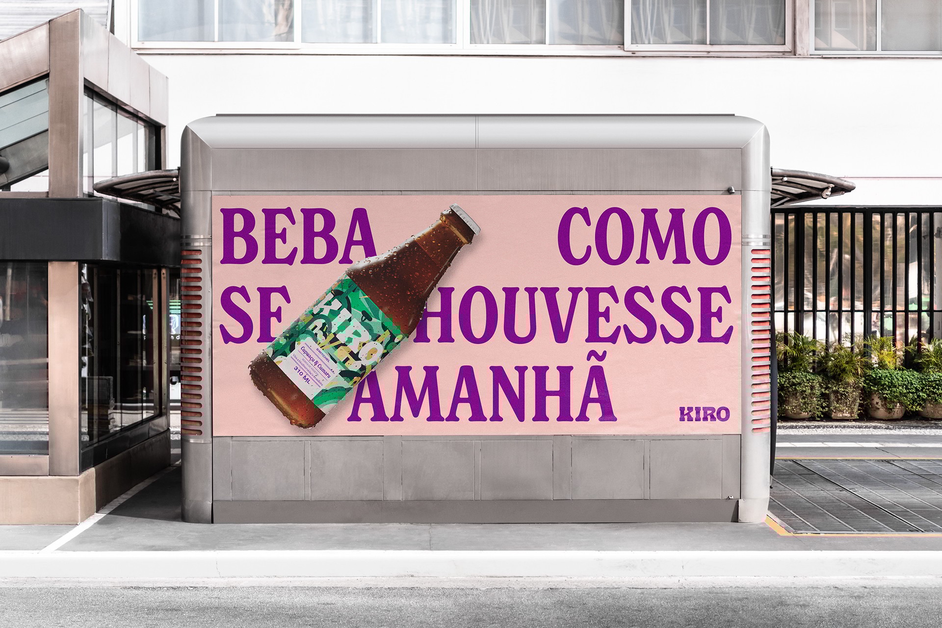
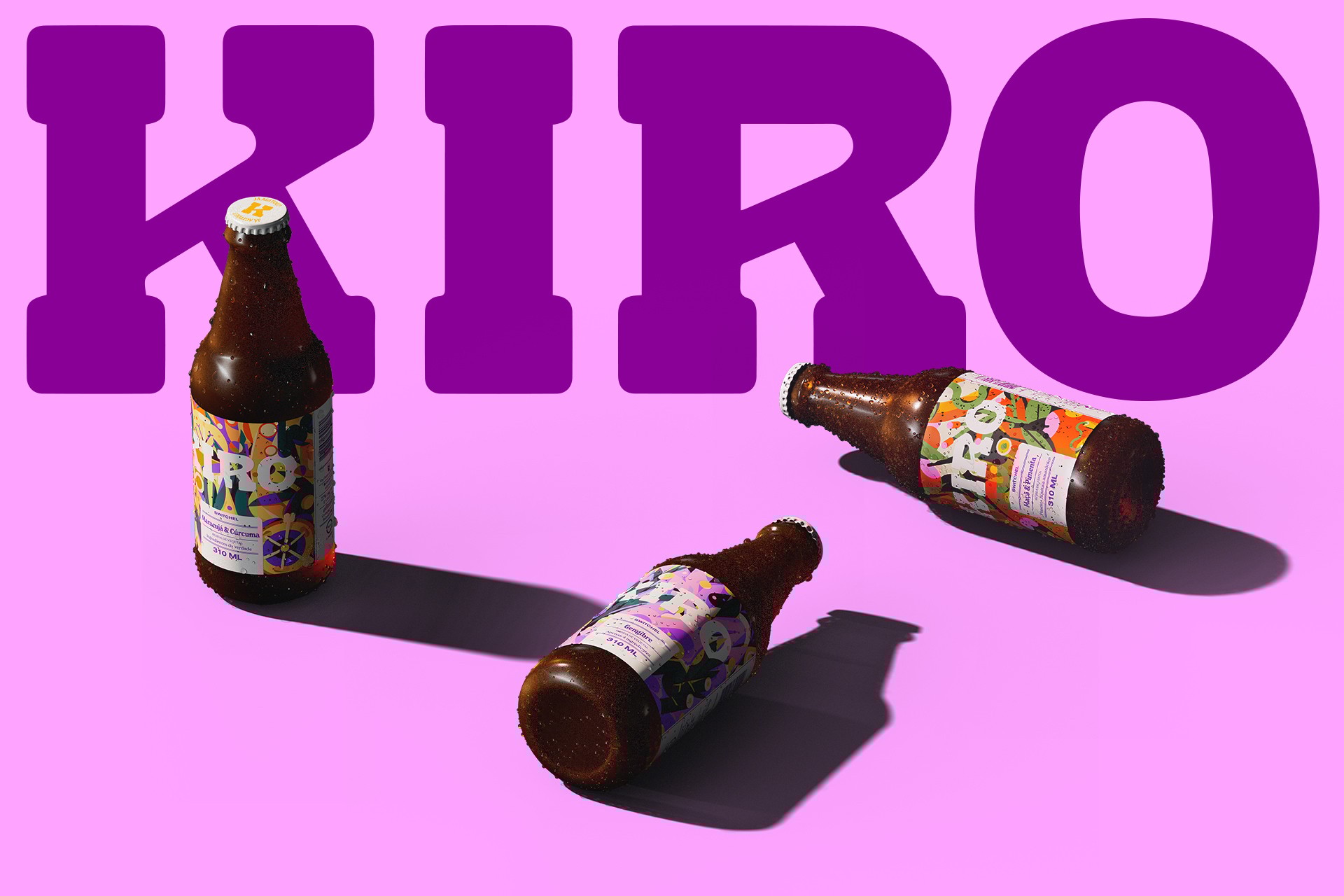
To reflect this mature moment of the business, the beverage labels were redesigned, stressing the protagonism of some elements already consacred: the logo (Estúdio Colletivo) and the illustrations (Fabrizio Lenci) that represent the ingredients of each flavor.
In addition to the labels, Kiro also received a new visual identity, contemplating a chromatic palette, illustrations and iconography, positioning the product as a drink beyond sober curious and suitable for all occasions. The new typographic palette has been designed for a brand that makes a great of use of text in its communication: words and sentences are arranged for creating familiar textures, stressing the idea that Kiro “knows” very well.
I was invited to participate in the redesign process for the visual identity creating 3D models for the bottle and can in all their flavour range (alcoholic and non-alcoholic) which was used in their new communication and motion graphics.
back
©2026 - Lukas Kawakami
↖
Kiro Switchel
about
credits
Polar LTDA.
Creative Direction:
Bruno Ribeiro, Lais Ikoma, Ralph Mayer,
Ronaldo Vidal
Identity Illustrations:
Stella Bonici
Illustrations:
Fabrizio Lenci
3D Design:
Lukas Kawakami
3D Motion Design:
Visor.ooo
Kiro
Leeward Wang, Roberto Meirelles
Since 2017, the company’s purpose has been to offer a drink that is not only healthy and clean label, but also to create a sustainable business capable of strengthening small producers.
The four flavors and the canned version (carbonated and alcoholic) are made with ingredients of agroecological origin. Nowadays, production, which started in the home of one of the founders, takes place in its own factory in São Paulo, granting full control of the production chain. All this care, combined with the intense and refreshing flavor, makes Kiro a brand with a devoted public.
To reflect this mature moment of the business, the beverage labels were redesigned, stressing the protagonism of some elements already consacred: the logo (Estúdio Colletivo) and the illustrations (Fabrizio Lenci) that represent the ingredients of each flavor.
In addition to the labels, Kiro also received a new visual identity, contemplating a chromatic palette, illustrations and iconography, positioning the product as a drink beyond sober curious and suitable for all occasions. The new typographic palette has been designed for a brand that makes a great of use of text in its communication: words and sentences are arranged for creating familiar textures, stressing the idea that Kiro “knows” very well.
I was invited to participate in the redesign process for the visual identity creating 3D models for the bottle and can in all their flavour range (alcoholic and non-alcoholic) which was used in their new communication and motion graphics.
back
↖
©2026 - Lukas Kawakami
Kiro Switchel
about
credits
Polar LTDA.
Creative Direction:
Bruno Ribeiro, Lais Ikoma, Ralph Mayer, Ronaldo Vidal
Identity Illustrations:
Stella Bonici
Illustrations:
Fabrizio Lenci
3D Design:
Lukas Kawakami
3D Motion Design:
Visor.ooo
Kiro
Leeward Wang, Roberto Meirelles
Since 2017, the company’s purpose has been to offer a drink that is not only healthy and clean label, but also to create a sustainable business capable of strengthening small producers.
The four flavors and the canned version (carbonated and alcoholic) are made with ingredients of agroecological origin. Nowadays, production, which started in the home of one of the founders, takes place in its own factory in São Paulo, granting full control of the production chain. All this care, combined with the intense and refreshing flavor, makes Kiro a brand with a devoted public.
To reflect this mature moment of the business, the beverage labels were redesigned, stressing the protagonism of some elements already consacred: the logo (Estúdio Colletivo) and the illustrations (Fabrizio Lenci) that represent the ingredients of each flavor.
In addition to the labels, Kiro also received a new visual identity, contemplating a chromatic palette, illustrations and iconography, positioning the product as a drink beyond sober curious and suitable for all occasions. The new typographic palette has been designed for a brand that makes a great of use of text in its communication: words and sentences are arranged for creating familiar textures, stressing the idea that Kiro “knows” very well.
I was invited to participate in the redesign process for the visual identity creating 3D models for the bottle and can in all their flavour range (alcoholic and non-alcoholic) which was used in their new communication and motion graphics.
back